Redesigning the Product Compare Experience
Grainger is the leader B2B MRO (Maintenance, Repair, and Operations) Distribution and as of 2016 ranked 10th largest eCommerce retailer in North America with sales exceeding $10 billion and 3 million monthly visitors on Grainger.com. Customers are often making complex, spec-driven purchasing decisions on behalf of their businesses, and the ability to effectively compare products against one another is a valuable tool to ensure confidence in their product selection.

COMPARE FEATURE COMPONENTS
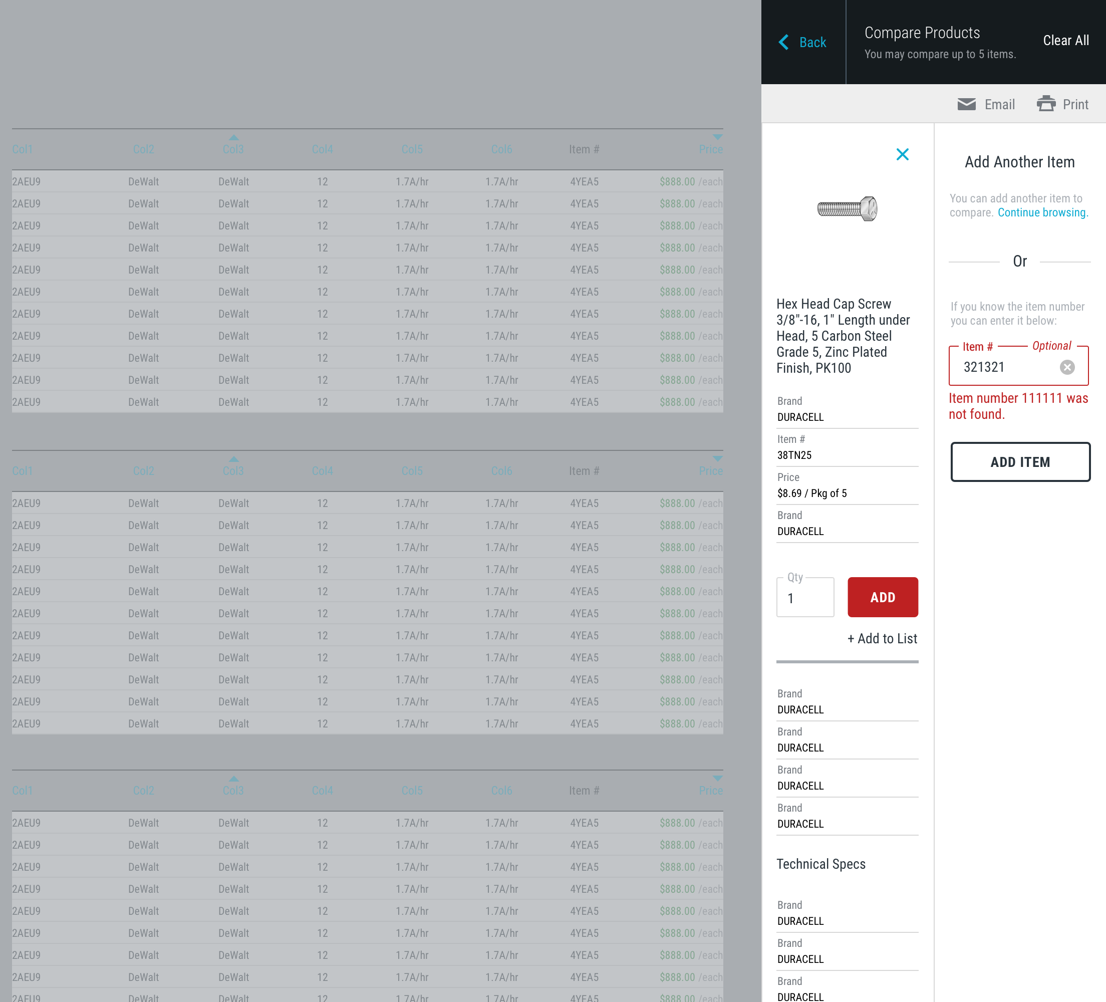
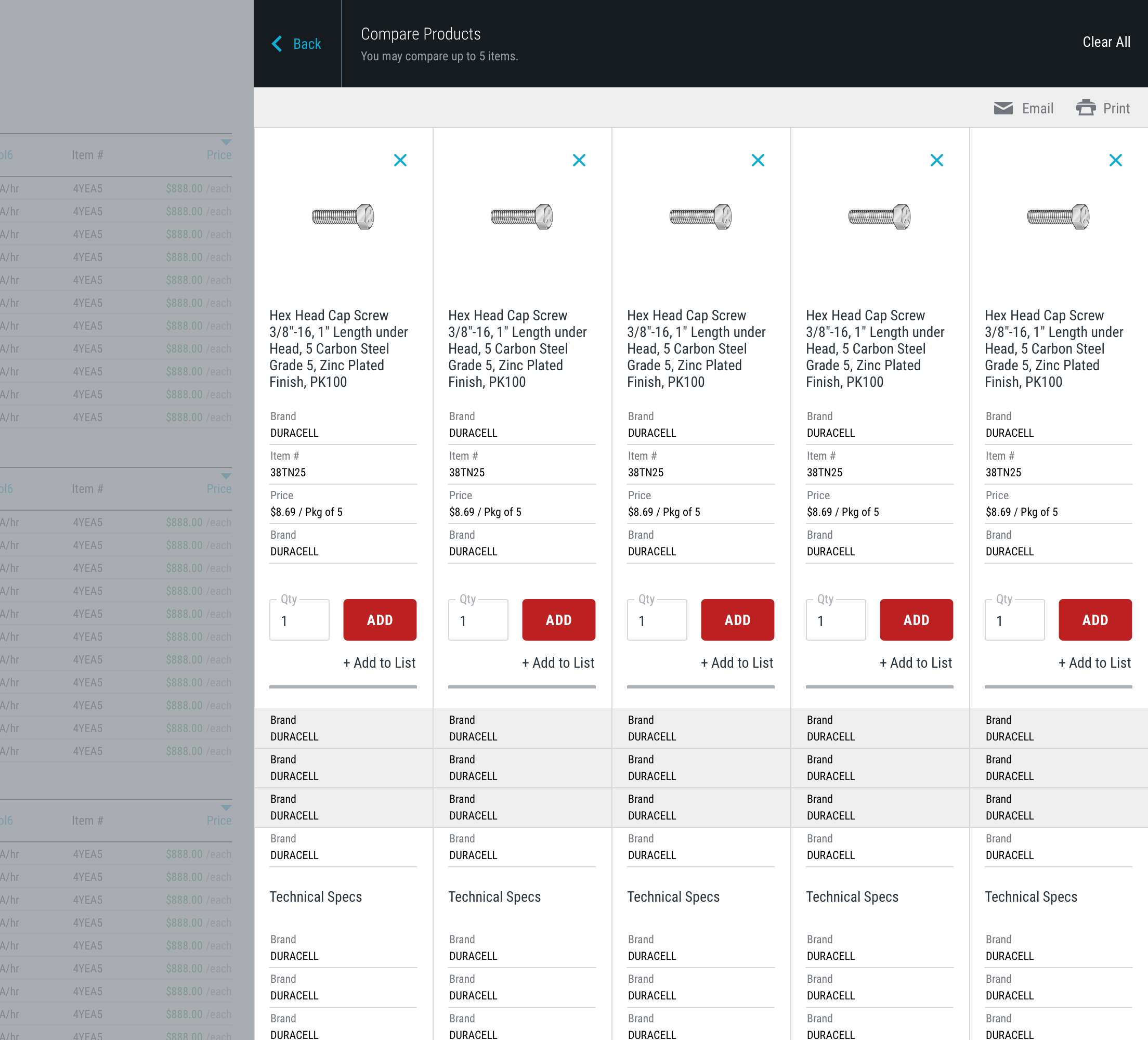
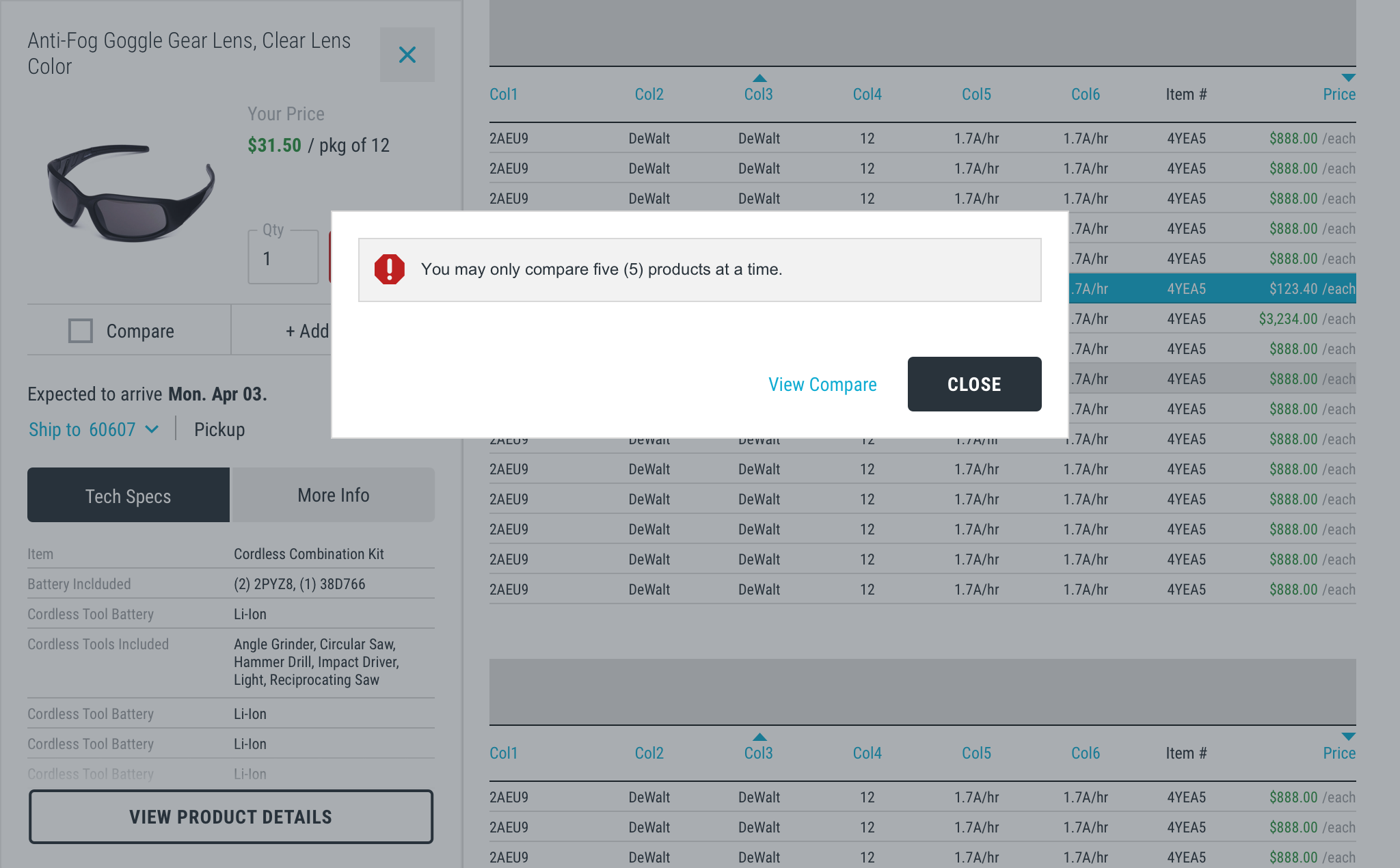
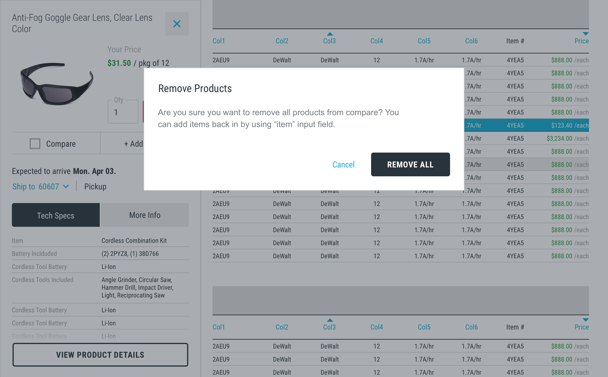
The product compare feature is accessible anywhere on the site where a product is present. In the pre-redesign state, the user selects a “Compare” checkbox to initiate a product compare panel that follows the user throughout their Search/Browse experience. Users can add up to 5 items for comparison and can additionally add items directly into the panel by entering a Grainger SKU number. The user must trigger the full compare view by selecting the “View Compare” button from the panel which removes them from the browse experience and into a product compare page with a full listing of technical specifications.
Room for Improvement
The compare feature provides the utility of having a readily accessible compare panel to track compare progress. However, user feedback surfaced several opportunities for improvement to increase potential usage and adoption of the Compare functionality and reduce the perceived obtrusiveness of the stalker panel.
In addition, according to internal analytics, users who use the compare feature are more likely to convert to purchase when compared to non-users, so redesigning the experience to more closely align to user needs and expectations presented an opportunity to increase engagement and sales conversions.
My role: I was a UX Architect on a team of 2 Architects, 1 Visual Designer, and 1 Researcher dedicated to collaborating on the redesign of the Compare experience. I was heavily involved in the brainstorming, sketching, ideation and research planning for the project. I created Axure prototypes for key tasks in the Compare experience that were used for unmoderated user testing via UserZoom and functional specifications and documentation supporting the development of the experience.
User Feedback
“I have checked the items I want to compare, but I cannot find the button to show the side by side comparison page.”
”Unable to figure out how to compare Finish Thompson pump tubes side by side easily. Could check the “Compare” button next to each item, but could not find the final button to actually compare them”
Understanding Customer Pain Points
Through voice of customer feedback that has accumulated since its initial release, key customer concerns emerged that we were sure to address via the redesigned experience:
· Customers’ biggest complaint was toggling between the different results screens, tray, and full compare screen
· Customers also noted difficulties triggering the full compare view and understanding the side- by-side view when displayed
In order to have a fuller understand of how to improve the product comparison experience, the team completed an evaluation of the current state experience, the team conducted an expert review/heuristic analysis to assess our experience againist competitors and leading eCommerce sites that offer similar functionality. We also compiled possible questions to ask users in future usability studies.
Current compare evaluation excerpt
Redesigned Compare Experience
We redesigned the Compare experience to address those consistent user issues that have presented themselves since the initial release of the compare feature. The redesigned compare experience reduces the amount of steps to producing a side- by-side comparison of technical specs—the core function desired by users using Compare. The new design also limits Compare view to one core experience—replacing the existing tray view and full compare view. Within the new experience, the user can enter compare mode when they are ready to view a full comparison without a distracting panel impeding the view of page content. The new design also preserves the existing page context—mitigating the issue of users being taken to a completely different page context when viewing a full comparison of specs. The UI design also takes cues from existing apps familiar to a large subset of customers—contributing to design consistency across channels.
Functional Specifications Excerpt
Final Comps


User Testing Prototype
After developing viable Compare experience concepts with the team, I created a prototype used for unmoderated user testing that addressed the core tasks associated with the Compare experience:
Do users understand how to launch and add items to the Compare feature?
How do users approach adding items to the Compare feature?
Do users understand how to open the Compare screen from a collapsed state?
Note: Additional task details can be found in the prototype testing notes.
Test Results & Outcomes

Compare Prototype User Feedback
“The proposed design creates less of distraction than the popup page
giving a feel of control which draws us back to the familiar main layout.”
“It is easy to switch gears to and back between the experience. It felt more intuitive to use and easier to see.”
“I usually write down, on a clip board and yellow legal pad what I want to order and the pricing. This compare feature would be a nice addition.”
The response to the redesigned Compare experience was positive overall. The majority of users were able to successfully complete all three tasks as indicated by the high success rates. This indicates an overall the compare feature is easy to use.
The results did alert the team to possible opportunities to incorporate into the design. The task of adding items once on the compare screen did not perform as well when looking at time on task. Despite the high perception ratings, video recordings of user actions indicated users struggled a bit with how to return to the search results and how to utilize the Add Item button. This is a potentially learned behavior, but future iterations will address these concerns (and the team will work with front end developers on possible transition effect that could potentially mitigate those issues).
When taking all the data and feedback into account, users have stated the design is easy to use. However based on customer feedback, there are opportunities to improve product selection and navigating between the screens to improve the overall compare experience (for example, animations and indicators could help reinforce actions). The positive response from customers via user testing made the team comfortable proceeding with the redesign.