Project: Heidrick & Struggles Website Redesign
Background

Heidrick & Struggles is a leading global firm that specializes in Executive Search and Leadership Consulting. This project was started at the onset of COVID lockdowns, and—like everyone who had planned for close in-person interaction and collaboration at the onset of a new project—we had to pivot to online-only interaction (including meeting our client contacts for the first time). Executing a full site redesign with stakeholders across multiple countries, with significant collaboration across digital whiteboards and Webex windows and comprising numerous phases and sprints was a significant challenge that my collective team eagerly tackled.
My Role
I was the sole UX Designer for this project, but it also provided me with the opportunity to wear multiple hats, including research, business analysis, strategy, and QA. I was involved in all phases of the project from discovery through delivery.
Key Activities
Website redesign, heuristic analysis, competitive analysis, site audit, information architecture, design thinking activities, workshop facilitation, persona creation, journey mapping, MVP planning, sprint planning, wireframes, design system creation, tree testing, first click testing, functional specification documentation.
Team
1 Lead UX Designer (my role)
1 Digital Strategist
2 Visual Designers (Creative Director and Visual Design Lead)
1 Content Strategist
1 Brand Strategist
1 Data Strategist
1 Technical Architect
3 Backend Developers
2 Frontend Developers
1 Project Manager
Stakeholders: Global Client Team and Leadership
PROBLEM
Tranforming an Outdated Experience
The Heidrick & Struggles team had three strategic goals for this project: 1) Develop a website that enhances the Heidrick & Struggles brand and supports continued growth and evolution, 2) Create a high-performing, seamless user experience, and 3) Build a site that optimizes content management system capabilities and marketing technology stack where possible.
The client communicated that they had a number of failed agency engagements and false starts that prevented moving forward with a full redesign of their digital experience. The primary failure of prior agency engagements was a lack of shared understanding of vision and misalignment on desired outcomes. Our team recognized the importance of our discovery phase to avoid repeating history. We needed to provide the client with clarity, transparency, and strong guidance along the way.

A digital experience in desperate need of both visual and strategic direction.
PROCESS
Diving Deeper - Understanding the Problem Space through Discovery
The discovery phase was a cross-functional effort across all teams. We developed hypotheses, gained an understanding of target audiences, gathered client assumptions and challenges with the current experience, and identified and aligned on a clear direction forward.
Foundational User Research and Insight
The discovery phase of this project and subsequent phases were built on a solid foundation of user insights to guide our decision-making and rationale. During this phase I collaborated with our digital and brand strategists to create an interview guide and survey of both internal (n=91) and external (n=228) users. Beyond providing us with insights on key audiences for the firm, findings from these users provided us with ample direction to guide the development of personas and user journeys later in the project.
Site Audit
I conducted an assessment of the current website via heuristic analysis and documentation of the existing information architecture, component matrix—identifying any critical usability issues.

Excerpt of the site audit which identified critical usability issues throughout the experience.
Competitive Analysis
As a team, we conducted a collaborative competitor analysis of both key competitors and aspirational sites across the following dimensions: 1) Identity (Visual & Verbal Expression), 2) Experience (Content, UX, Features), and 3) Activation (Digital Channels). My focus was on the critical usability dimensions identified for the website.

Competitor analysis excerpt
Key Takeaways from Discovery
The collective team synthesized our insights and uncovered the following key themes that guided the next phases of work:
The current digital experience is disconnected from the firm’s underlying business drivers and doesn’t adequately reflect clients’ and candidates’ positive feelings about working with the firm.
Clients know the firm’s reputation—but the market is unclear on what makes them exceptional.
Target audiences demand a more efficient, relevant experience.
For Heidrick.com to become a destination site, content must deliver more consistent value.
The energy and insight of the client experience must find expression in the digital experience.
SOLUTION
Defining and Designing the Digital Experience
After gaining alignment with the client on a path forward from the discovery phase of the project, our next step was to dive into defining and designing the new digital experience. The discovery phase provided us with a significant amount of both quantitative and qualitative data to synthesize, requirements to gather, and ideas to share to create a memorable experience that addressed the challenges and themes uncovered. This phase also included constant collaboration across teams to inform the experience, and required me to manage multiple workstreams to achieve progress in my own work.
Personas and Journey Maps
I collaborated with our Digital Strategist and facilitated client workshops using Miro to create personas and journey maps to provide clear reference points to their target audiences and provide clarity on their end-to-end experiences, highlighting digital touchpoints and areas of opportunity.
PERSONAS:


JOURNEYS:


Tree Testing and Information Architecture
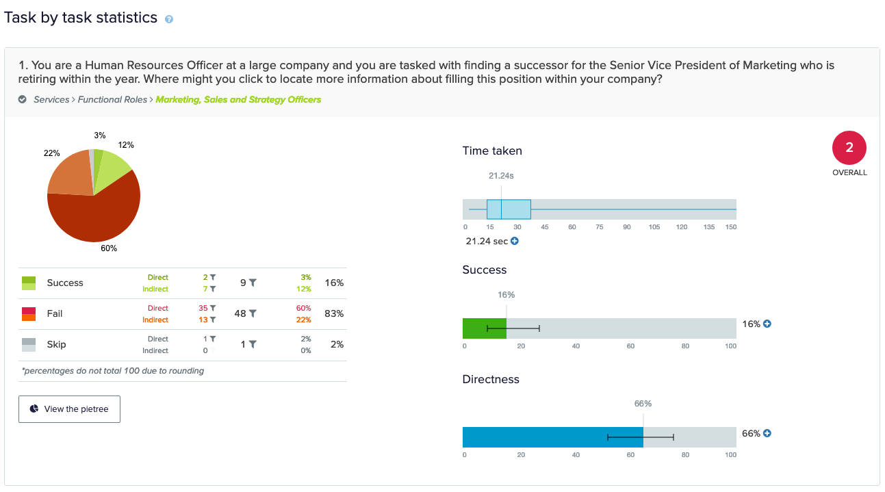
Tree Testing task that revealed nomenclature issues to explore further.
During the site audit, I observed a linear navigation structure and labeling that obscured content important to target audiences of the site as a potential opportunity. A review of analytics supported this as there was little movement across site sections and a high bounce rate—indicating that users may not be finding what they’re looking for. Using personas and journeys as a reference for task identification, I conducted a tree test with 60 participants on a proposed navigation structure that presented clearer pathways and direct links to important site sections.
As a result of tree testing, I identified areas of opportunity for clarity in labeling, uncovered unexpected content pathways and expectations, and determined future testing opportunities. Tree testing results led to a high-level IA that should make it easier for target audiences to locate critical information.
HIGH LEVEL INFORMATION ARCHITECTURE

Creating the Framework: Ideation, Planning, and Requirements Gathering
Next we moved on to ideation and giving shape to the ideas and rationale our work thus far had provided. This next phase included creating wireframes, gaining client approval to move forward to design, and gathering requirements—including an understanding of underlying data models, content relationships and tagging. To streamline our work during this phase, I created a process for Sprint planning that allowed us to identify the proper cadence of work and order of page templates and components for an efficient site build.
Sprint Planning
We were scoped for three sprints of work—each of which included developing a set of page templates that needed to satisfy the overarching goals of the digital experience. My process included:
Internal Sprint Kickoff
For each sprint, I created a Miro board template for the core cross-functional team to focus on goals & priorities, key actions, identified MVP items, connections to personas/journeys, technical considerations/constraints, and client questions for each template. We also explored inspiration sites and references to help with idea generation.
Client Sprint Kickoff
Informed by our Internal kickoff, I then created a sprint kickoff presentation to gain alignment for each template with the client, gather any additional requirements, and get answers to any outstanding questions.

Collaborative sprint planning Miro board.
Sketching and Wireframes Presentation
With a clear understanding of goals, priorities and key actions for each template, I conducted sketching sessions with the team to explore ideas for each template. I created wireframes in Figma and developed the beginnings of a component library that would later evolve into the site design system.
Each sprint’s wireframes were presented to the client and met with minimal revisions due to this highly collaborative approach. Along with wireframes, presentations included: 1) expectation setting, 2) rationale and supporting data, and 3) a reiteration of goals, actions, and references to user personas and journeys.


6 out of 11 total desktop wireframe templates.
Designing the Experience
Once each sprint was approved, our design team could begin implementing the visual layer and apply the established thematic design direction to the wireframes. While concurrently planning and executing the next sprints, I also worked closely with our Visual Designer and Creative Director to further flesh out a design system—identifying interactions, microinteractions, alternate states, and edge cases across the entirety of the experience.
Design System

Design system excerpt
Final Designs

Final desktop and mobile design for two key page templates. The new design provided the client with a unique brand expression with more custom line art and abstract imagery instead of page after page of stock photography.
Build & Delivery
Functional Specification
The final site we created was complex, with a number of global and common components, interaction states, and conditions that needed to be managed carefully during the build process. Additionally, the client needed ultimate clarity on what would/would not be built. To manage the build along with client feedback and technical questions, I wrote and iterated on Functional Specification with consultation from our development teams using Confluence and Figma embeds for visual reference and annotations.
This format allowed the client and development teams to ask questions inline, with a clear comment and versioning history. With build nearly complete on this site, this format contributed to a highly efficient backend and frontend build.

Confluence was an effective tool for managing functional notes, requirements, and client feedback.
Outcomes
This project is in the final phases of development, QA, and client content entry. The final design was highly praised by the client team, and the resulting website redesign was a marked transformation from the previous state—providing the client with a user-centered digital experience that exceeded their expectations and positions them for success against their competitors. We established a trusting relationship with the client, and our approaches and deliverables were highly valued. As a result, we were selected as their agency of record and will continue to execute the product road map we built with them—no small feat to achieve ahead of launch. (Expected launch May 2021.)